Retail Back Office: Marketing - Campaigns
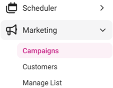
Navigation: Sign into the Back Office for your Retail Store, then select Marketing > Campaigns
The Campaigns screen displays a table containing the created Marketing campaigns, with the following columns:
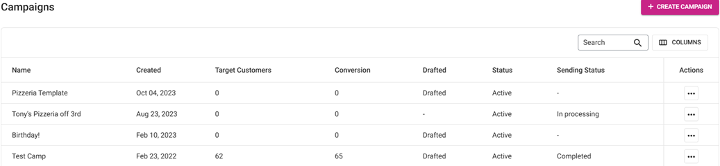
- Name: The name of the campaign.
- Created: The date the campaign was created.
- Target Customers: The number of customer target points.
- Conversion: The amount of conversion points.
- Drafted: If the campaign currently has a finish later status.
- Status: The current status of the campaign.
- Sending Status: The status of the campaign when in the process of being sent.
- Actions: Click the three dots ••• for the following options:
- Unsent campaigns: Edit and Delete
- Sent Campaigns: Clone and Delete
- Clone: When clicked, the details of the existing Campaign will be copied and used to create a new Campaign
- Delete: When clicked, the Delete pop-up appears with options for Delete and Cancel
- If Delete is selected the Campaign will be deleted
- If Cancel is selected, the Campaign will be kept
Creating A Campaign
- To create a new Campaign, click + Create Campaign.
- To edit a drafted Campaign click ••• then Edit (proceed directly to Step 5). Only unsent Campaigns can be edited.
- When clicked, the New Campaign pop-up appears.
- Enter the Name of the campaign (mandatory). There are no length or character type restrictions.
- Click Start to begin creation of the named new Campaign.
- Click Cancel to cancel the creation of the campaign.
- The Create Campaign screen appears, with the Name of the Campaign appearing at the upper-left. It is broken down by tabs: What, Who, When and Review (see below):
- To edit the name of a Campaign, click the pencil icon next to the name.
- When all updates have been made to the Template and you’re ready to send it, click Save and Start. You’re returned to the main Campaigns screen where the pop-up message ‘Campaign has been successfully created’ appears, and the Sending Status will be updated to In Processing.
- At any point in during creation of the Campaign, click Finish Later then Save Draft to save the Template as a draft. You’re returned to the main Campaigns screen where the pop-up message ‘Campaign has been successfully created’ appears.
What
Who
When
Review
What
- Select the Type of channel to send this campaign (Example: Email).
- Subject
- Subject. It has a limit of 150 characters.
- Select the sorting from the dropdown (Personalize, Contact’s First / Last Name, or Company Name).
- Enter the Preheader. It will have a limit of 150 characters.
- Select the sorting from the dropdown (Personalize, Contact’s First / Last Name, or Company Name).
- After entering both the Subject and Preheader, the circled red
will change to a green check mark
. Click Next to set the Sender.
- Sender
- Enter the Name of the Sender. It will have a limit of 100 characters.
- Enter the Email Address to which the customer would Reply To.
- After entering both the Sender Name and Reply-To Address, the circled red
- If the new Campaign was cloned from another Campaign, the Design a campaign button won’t be available. Instead the following buttons are available:
- Send Test Email – A pop-up will appear. Enter an Email Address to send a test email. Then click Send test.
- Edit – You are taken to the Content Editor.
- Delete – The current Content is deleted, and the Design a Campaign button appears.
- Content – Click Design a campaign, and a new screen appears with the following tabs:
- New Template – Create a new Template by selecting a Template (+ Blank Template or another default design). You are taken to the Design campaign tab, with sections for Content, Blocks and Body. When you are done updating a new or default template, you will be able to save it where it will appear as a Saved template.
- Saved template – View all previously saved Templates as part of Campaigns. Click the Use or Edit button to go to the Design campaign tab. Make edits as needed then click Save Template to save updates and add content to the Campaign. Click Delete to remove the content from the saved template tab. Delete will open a popup to cancel or Confirm the deleting of the Template
- Select the from the main tab options: Content, Blocks, or Body. You can also select Display View.
- Display View – To view the display options, click the Preview (eye 👁) icon at the upper-right. Then select the device view option at the upper-center. To exit View mode and return to Edit mode, click the x on the right-side of the Display View row.
- Desktop [default] – The left-side Monitor icon. The default is iMac (1280px).
- Tablet – The middle Tablet icon. The default is iPad Mini (768px).
- Mobile – The right-side Mobile Phone icon. The default is Android (360px).
- Pixel (px) – Select the dropdown to view resolutions based on several Desktop, Tablet and Mobile devices. You can also manually change the pixel Width at the top by clicking the corresponding box and entering a value. To revert it to the default iMac Desktop option, click the Reset (circular arrows) button.
Select a below option (Content, Blocks or Body) to display more information about the selection.
Content
Contains multiple tile options for designing the campaign. The tiles are clicked-and-dragged into the body of the template to establish the overall structure by row, repeating the usage of each tile as needed.
- Duplicate – Use the double square icon to duplicate a Column. It will add the same properties and content already in the column for a second time on the Template. Click on the new Columns to make changes.
- Delete – Trash Can icon at the upper-right. Click to delete the selected row.
- Close (X) - The pane will be closed with row updates kept.
- Columns – Select a percentage of the ratio of the columns (100%, 50% | 50%, 33% | 33% | 33%, etc.).
- Column Properties – Set the properties of the selected column (add a column with + or delete one with the trash can icon).
- Background Color – Click the corresponding square to bring up the color picker. To pick a color: you can click on the shader square, use the primary color slider, enter a Hex or RGB code, or pick from a Common Color dropdown and select a Template Color.
- Padding – Enter the padding size (pixels) of All Sides of the column or use +/- to increase/decrease. Enable the More Options toggle to customize the individual sides.
- Border – Select the type of border of All Sides of the column (solid, dotted, dashed) from the dropdown. Enter the size (pixels) of All Sides of the border or use +/- to increase/decrease. Enter the size (pixels) of All Sides of the border or use +/- to increase/decrease. Select a border’s color by clicking on the color box. To remove the color, click the x. Enable the More Options toggle to customize the individual sides.
- Row Properties
- Background Color – Select the background color (color picker).
- Content background color – Select the content background color (color picker).
- Background Image – Click Upload image then select the image saved on your computer, or paste the URL of the Image that’s saved online.
- Padding – Enter the padding size (pixels) of All Sides of the column or use +/- to increase/decrease. Enable the More Options toggle to customize the individual sides.
- Responsive Design
- Hide on Desktop – If the toggle is enabled (slid to the right), it will be hidden on the Desktop version. If disabled (slid to the left with x on the right), it won’t be hidden.
- Heading – For a Heading section, a pane with the following settings appears:
Get Suggestion: For Smart Headings, click Try It Now to get heading suggestions. - Text
- Heading Type: Select the Type (hierarchy) H1, H2, H3, or H4.
- Font Family: Select the display font from the dropdown.
- Font Weight: Select the weight of the font (Regular or Bold) from the dropdown.
- Font Size: Enter the size of the font – or use +/- to increase/decrease the size.
- Color: Select the color of the font (color picker).
- Text Align: Select the alignment of the Heading (Left, Center, Right, Justify).
- Line Height: Enter the height of the line (%) – or use +/- to increase/decrease the percentage.
- Links – If the Inherit Body Styles toggle is enabled, no additional fields will appear under Links, and any links in the heading will use the same font settings set above. If disabled, select the Color then enable or disable the Underline toggle.
- General – Enter the Padding of All Sides of the container (px) or use +/- to increase/decrease the size. If the More Options toggle is enabled, you can set the Padding of each side individually.
- Responsive Design – If the toggle is enabled the heading will be hidden on Desktop view. If disabled it will not be hidden.
- If you click on the Heading box in the main area there are quick actions available to Bold, Italicize, Underline, Strikethrough, Superscript, Subscript, Insert Link, Remove Link, and Add Emoticons
- Text – For a Text section, a pane with the following settings appears:
- Text
- Heading Type: Select the Type (hierarchy) H1, H2, H3, or H4.
- Font Family: Select the display font from the dropdown.
- Font Weight: Select the weight of the font (Normal or Bold) from the dropdown.
- Font Size: Enter the size of the font – or use +/- to increase/decrease the size.
- Color: Select the color of the font (color picker).
- Text Align: Select the alignment of the Heading (Left, Center, Right, Justify).
- Line Height: Enter the height of the line (%) – or use +/- to increase/decrease the percentage.
- Letter Spacing: Enter the size of the spacing between the letters – or use the +/- to increase/decrease the size.
- Links – If the Inherit Body Styles toggle is enabled, no additional fields will appear under Links, and any links in the heading will use the same font settings set above. If disabled, select the Color then enable or disable the Underline toggle.
- General – Enter the Padding of All Sides of the container (px) or use +/- to increase/decrease the size. If the More Options toggle is enabled, you can set the Padding of each side individually.
- Responsive Design – If the Hide on desktop toggle is enabled the heading will be hidden on Desktop view. If disabled it will not be hidden.
- Clicking on the Content section in the Design area will give a quick pane to Bold, Italicize, Underline, Strikethrough, change Font Color, change Font Background Color (aka highlight), Superscript, Subscript, Emoticons, Bullet List, Number List, Add Link, Remove Link and Collapse Toolbar.
- Image – For an Image section, a pane with the following settings appears:
Get Suggestion – For Magic Image, click Try It Now to get image suggestions. - Image – Click Upload image then select the image saved on your computer, or paste the URL of the Image that’s saved online.
- Width – If the Auto On toggle is enabled, the size of the image will be set automatically. If disabled, set the percentage (%) slider as needed.
- Align – Select the alignment of the Image (Left, Center, Right, Justify).
- Alternate Text – Enter any text to appear when images are not displayed in an email and to be read for those with text readers.
- Action – Select an option from the dropdown, what will trigger when the image is clicked:
- Open Website – Enter the URL of the website, then whether it opens within the Same Tab or a New Tab.
- Send Email – Enter the Mail To address (what email address will appear in the To: field of the newly created email), then enter the Subject line of the email, followed by what will appear in the Body of the email.
- Call Phone Number – Enter the 10-digit phone number that will appear for the email recipient to call.
- General – Enter the Padding of All Sides of the container (px) or use +/- to increase/decrease the size. If the More Options toggle is enabled, you can set the Padding of each side individually.
- Responsive Design – If the Hide on desktop toggle is enabled the heading will be hidden on Desktop view. If disabled it will not be hidden.
- Button – For a Button section, a pane with the following settings appears:
- Action – Select an option from the dropdown, what will trigger when the image is clicked:
- Open Website – Enter the URL of the website, then whether it opens within the Same Tab or a New Tab.
- Send Email – Enter the Mail To address (what email address will appear in the To: field of the newly created email), then enter the Subject line of the email, followed by what will appear in the Body of the email.
- Call Phone Number – Enter the 10-digit phone number that will appear for the email recipient to call.
- Button Options – Select the following
- Background Color
- Text Color (color pickers).
- Width (if the Auto On toggle is enabled, the size of the image will be set automatically. If disabled, set the percentage (%) slider as needed).
- Font Family – Select the display font from the dropdown.
- Font Weight – Select the weight of the font (Normal or Bold) from the dropdown
- Font Size – Enter the size of the font – or use +/- to increase/decrease the size.
- Line Height – Enter the height of the line (%) – or use +/- to increase/decrease the percentage.
- Letter Spacing – Enter the size of the spacing between the letters – or use the +/- to increase/decrease the size.
- Spacing
- Align – Select the alignment of the Image (Left, Center, Right, or Justify).
- Padding – Enter the Padding of All Sides of the spacing (px) or use +/- to increase/decrease the size. If the More Options toggle is enabled, you can set the Padding of each individual side.
- Border – Select the type of border of All Sides of the column (solid, dotted, dashed) from the dropdown. Enter the size (pixels) of All Sides of the border or use +/- to increase/decrease. Select the Color Picker to change the color of the border or click the x for no border color. Enable the More Options toggle to customize the individual sides.
- Rounded Border – Enter the size (pixels) of All Sides of the rounded border or use +/- to increase/decrease. Enable the More Options toggle to customize the individual sides.
- General – Enter the Padding of All Sides of the Container (px) or use +/- to increase/decrease the size. If the More Options toggle is enabled, you can set the Padding of each individual side.
- Responsive Design – If the Hide on desktop toggle is enabled the heading will be hidden on Desktop view. If disabled it will not be hidden. Clicking on the content in the Design area will produce a pane to Bold, Italicize, Underline or Strikethrough the button font.
- Divider – For a Divider section, a pane with the following settings appears:
- Line
- Width – Use the slider to adjust the width of the line (it will automatically reflect in the template preview).
- Line – Select the type of line from the dropdown (Line, Dotted, or Dashed), then enter the thickness of the line (or use +/- to increase/decrease it).
- Align – Select the alignment of the Divider (Left, Center, Right, or Justify).
- General – Enter the Padding of All Sides of the Container (px) or use +/- to increase/decrease the size. If the More Options toggle is enabled, you can set the Padding of each individual side.
- Responsive Design – If the Hide on desktop toggle is enabled the heading will be hidden on Desktop view. If disabled it will not be hidden.
- HTML – For an HTML section, a pane with the following settings appears:
- HTML – A text box where you will be able to use HTML commands to customize the section to your exact specifications. The example used will be <strong>Hello, world!</strong> to display Hello, world!
- General – Enter the Padding of All Sides of the Container (px) or use +/- to increase/decrease the size. If the More Options toggle is enabled, you can set the Padding of each individual side.
- Responsive Design – If the Hide on desktop toggle is enabled the heading will be hidden on Desktop view. If disabled it will not be hidden.
- Menu – For a Menu section, a pane with the following settings appears:
- Menu Items – When (+) Add Menu Item is clicked, a sub-section to select the Action Type appears:
- Open Website – Enter the URL of the website, then whether it opens within the Same Tab or a New Tab.
- Send Email – Enter the Mail To address (what email address will appear in the To: field of the newly created email), then enter the Subject line of the email, followed by what will appear in the Body of the email.
- Call Phone Number – Enter the 10-digit phone number that will appear for the email recipient to call.
- Multiple Menu Items be added – Click + New Item again for a second Action box. Use the 6 squares icon to drag the item above or below other items to reorder them. Click the Delete icon to remove the item
- Styles
- Font Family – Select the display font from the dropdown.
- Font Weight – Select the weight of the font (Normal or Bold) from the dropdown.
- Font Size – Enter the size of the font – or use +/- to increase/decrease the size.
- Letter Spacing – Enter the size of the spacing between the letters – or use the +/- to increase/decrease the size
- Text Color – Select the color of the text (color picker).
- Link Color – Select the color of any included clickable links (color picker).
- Align – Select the alignment of the Divider (Left, Center, Right, or Justify).
- Layout – Select how the overall layout should be structured (Horizontal or Vertical).
- Separator – Enter any text that will serve as a separator from another Menu section.
- Padding – Enter the Padding of All Sides of the spacing (px) or use +/- to increase/decrease the size. If the More Options toggle is enabled, you can set the Padding of each individual side.
- General – Enter the Padding of All Sides of the Container (px) or use +/- to increase/decrease the size. If the More Options toggle is enabled, you can set the Padding of each individual side.
- Responsive Design – If the Hide on desktop toggle is enabled the heading will be hidden on Desktop view. If disabled it will not be hidden.
- Social – For a social media section, a pane with the following settings will appear:
- Icon Type – Click the dropdown to choose from Circle, Circle Black, Circle White, Round, Round Black, Square, and Square Black
- Click on one of the social media icons and a Social Links box will appear with the same of the icon selected. Note: the icon that initially appears will change based on the previously selected type.
- URL – Enter your social media link for this social media platform
- If you selected more than one icon, each of them will show its own Social Links box. Use the 6 squares icon to drag and drop the boxes to reorder them. Use the trash can icon to delete the box.
- Align – Select Right, Center or Left alignment
- Icon Size – Enter the size number or use the -/+ to increase or decrease the size of the icons.
- Icon Spacing – Enter the spacing number or use the -/+ to increase or decrease the size of the icons.
- General > Container Padding – Enter the Padding of All Sides of the container (px) or use +/- to increase/decrease the size. If the More Options toggle is enabled, you can set the Padding of each side individually.
- Responsive Design – If the Hide on desktop toggle is enabled the heading will be hidden on Desktop view. If disabled it will not be hidden
Blocks
Select a percentage of the ratio of the blocks (100%, 50%|50%, 33%|33%|33%, etc.). You can hover over the blank boxes to view the ratios:
- Block Properties – Each column within the section will have its own series of following options:
- Background Color – Click the corresponding square to bring up the color picker. To pick a color: you can click on the shader square, use the primary color slider, enter a Hex or RGB code, or click the Common Color dropdown and select a Template Color.
- Padding – Enter the padding size (pixels) of All Sides of the column or use +/- to increase/decrease. Enable the More Options toggle to customize the individual sides.
- Border – Select the type of border of All Sides of the column (solid, dotted, dashed) from the dropdown. Enter the size (pixels) of All Sides of the border or use +/- to increase/decrease. Enable the More Options toggle to customize the individual sides.
- Row Properties
- Background Color – Select the background color (color picker).
- Content background color – Select the content background color (color picker).
- Background Image – Click Upload image then select the image saved on your computer, or paste the URL of the Image that’s saved online.
- Padding – Enter the padding size (pixels) of All Sides of the column or use +/- to increase/decrease. Enable the More Options toggle to customize the individual sides.
- Responsive Design
- Hide on Desktop – If the toggle is enabled (slid to the right), it will be hidden on the Desktop version. If disabled (slid to the left with x on the right), it won’t be hidden.
Body
This section is to preset or change settings for the whole Marketing Email. The following fields will appear in the pane:
- General
- Text Color: Select the color of the text (color picker).
- Background Color: Select the background color of the body (color picker).
- Content Width: Enter the width (pixels) of the body or use – / + to increase/decrease.
- Content Alignment: Select the alignment (Left or Center).
- Font Family: Select the style of font from the dropdown.
- Font Weight: Select the weight of the font (Regular or Bold) from the dropdown
- Email Settings
- Preheader Text: Enter any Preheader text (follows the Subject line when viewing an Email from the inbox) that you’d like to appear.
- Links
- Color: Select the color that the link text will appear (color picker).
- Underline: If enabled (slid to right with ✔) the link will be underlined. If disabled (slid to left with x) it won’t be underlined.
Saving the Template
- When ready to save the new Template, click Save Template. A pop-up with the message ‘Your campaigns design successfully saved’ appears.
- To cancel all current changes made to the Template, click Cancel.
- Once the Subject, Sender and Content are satisfied [marked with (✔)], click Next Step (or the Who tab) to navigate to the Who tab.
Who
- Select a Segment from the list of dropdown options: All Members, New, Recurring, At Risk, In Active, Bounced or Saved Lists (all saved customer lists on the Manage Lists page will show under Saved Lists, to be chosen as needed).
- To apply filters: select More Filters and the pane appears on the right. Select the corresponding box(es) to apply the following filters:
- Loyalty Points: Enter an amount of points or use ▲/▼ to increase/decrease the amount, then select to apply the filter to values that are Greater, Equal, Less, Greater (or) Equals, or Less (or) Equals.
- Customer anniversary: Select a Time Period from the dropdown Today, This week, This month, or if Date range is selected then select the Start Date and End Date (calendar picker).
- Date of birth: Select a Time Period from the dropdown Today, This week, This month, or if Date range is selected then select the Start Date and End Date (calendar picker).
- When all filters are satisfied, click Apply. The filters will be applied to the Template.
- Click Clear to de-select any filters and remove any selected options and close the pane.
- Click X (Close) to close the pane without applying the update(s).
- Use the Clear button to remove all filters or click the X next to an applied filter to remove it.
- To save the filtered results as a list, click Save As List.
- The Create a List pop-up appears, broken down by the following tabs:
- Click Cancel or Close (X) to cancel creating the list and return to the main Template page.
- List Name – Enter the List Name (Mandatory). Once the Name is entered, click Next.
- List Type – Select the Type of List (Static [default] [build once then edit manually] or Dynamic [automatically updates when data changes]). Once a Type is selected, select Next to proceed to the Review tab. Select Back to revert to the List Name tab.
- Review – The summary page which displays the entered List Name and selected List Type, along with the number of Targeted Customers. Click Save List to apply all the List settings and the ‘The list you created has been successfully saved’ pop-up appears, or Edit to revert to the List Name tab.
- Target Preview – View the Target Percentage and number of customers.
- When ready, click Next Step (or click on the When tab) to proceed to the When tab.
When
Select when to send the campaign. After selecting, click Next Step.
- Send Now – Send the campaign once finished and Save and Start is clicked.
- Schedule For Later – Select the Sending Date (calendar picker) then Sending Time (manually enter the Hour number then click on the Minutes and manually enter it), then click on the AM/PM to manually change), followed by the Time Zone from the dropdown.
- When ready, click Next Step (or click on the Review tab) to proceed to the Review tab.
Review
View the Total Email with Campaign Cost, then the What, Who, and When under the tab.
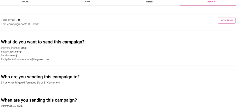
Buy Credit – When clicked, you have the option to buy Copper, Bronze, Silver, or Gold – or click Close (x) to cancel buying any Credit.
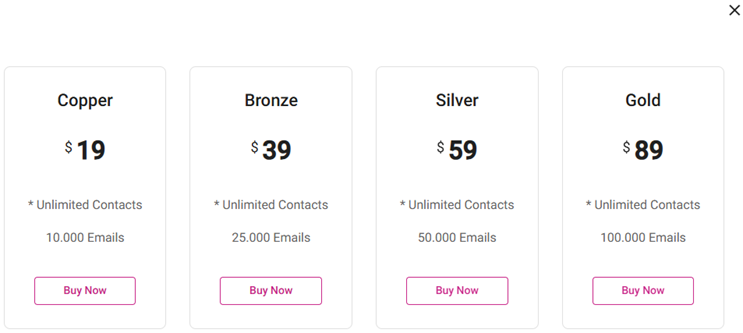
- When a corresponding Buy Now is selected for an option, enter the payment information, then click Submit Payment.
- When payment is completed, the Invoice screen appears – where you can Print the Invoice, View it as a PDF and/or Download it. Select X / Close to return to the Review tab.
Related Articles
Retail Back Office: Dashboard - Marketing
Navigation: Log into the BO for your Store, then on the Home page Dashboard select Marketing The Marketing dashboard appears. Select the Time Period from the dropdown, then click Apply. The Marketing dashboard will appear for that selected Time ...Retail Back Office: Subscriptions & Upgrades - Summary
There are 2 plans available for a Retail Subscription: Pro and Enterprise. Add-Ons for Retail The 9 addons available for Retail: Alerts, CDS, Feedback, Insights, Inventory, Loyalty, Marketing, Schedules, and Stock. Billing for Subscription The ...Back Office: Marketing Campaigns
Sign into the Back Office. Select a Store. Then on the left-side Navigation Panel, select Marketing then Campaigns. The Campaigns screen displays a table containing the created marketing campaigns, with the following columns: Name: The name of the ...Retail Back Office: Marketing - Settings
Navigation: Sign into the Back Office for your Retail Store, then select Marketing > Settings The Settings page contains options to quantify the thresholds for types of Customers. Enter the amount for each field, or use ▲/▼ to increase/decrease the ...Retail Back Office: Marketing - Customers
Navigation: Sign into the Back Office for your Retail Store, then select Marketing > Customers. The Customers page appears, displaying your customers’ details. Tiles appear at the top of the page, representing the Total number of Customers – then ...